Interpreting Relevant Information From Tables, Charts and Graphs: TEAS
Basic Terms and Terminology Relating to Interpreting Relevant Information From Tables, Charts and Graphs
- Cause-and-effect diagram: Also referred to as a “fishbone" diagram, an Ishikawa diagram, a causal diagram, and a herringbone diagram, a cause and effect diagram is highly useful to identify the causes of product defects and the causes of patient care problems and concerns.
- Flow chart: This chart displays the steps of processes and it is highly useful for identifying flawed and problematic processes and process steps.
- Check sheet: Used to both collect and visualize data. They may signal some frequency of events without performing complex statistics.
- Line graph: One of the simplest of all charts and graphs and one that has two axes; the vertical axis is referred to as the y axis and the horizontal axis is the x axis.
- Bar graph: A graph that is similar to a line graph, except a bar graph displays data with bars along the x and y axes and not lines like a line graph.
- Control chart: Also referred to as a Shewhart charts, this chart is based on the statistical data, which is unlike many other charts and graphs that are frequently used.
- Pareto chart: A combination of a bar graph and a control chart that displays data in descending order.
- Histogram: These graphs display frequency data in the context of its distribution.
- Scatter diagram: Also referred to as a scatter gram and a scatter plot, shows the correlations of two variables.
- Legend: A brief summary of what the table, chart or graph is depicting
- Labels: Labels include the name of the graph, which tells you what the graph depicts and the names of the x and y axes in terms of the variables that they are represented.
- Intervals: Intervals are regularly spaced segments of a graph that are labeled to allow us to determine a precise or approximate value for each data point.
- Axes: The standard of graphing indicates that the horizontal line is the x axis and the vertical line of the graph is the y axis.
- Point of origin: The point of origin on a table, chart and graph is sometimes shown as a zero and sometimes it is left unlabeled but understood as a zero and referred to as 0,0 according to the Cartesian coordinate system.
- Cartesian coordinate system: Standardized terminology for the identification of coordinates, which are the points where a data point on the x axis and the data point on the y axis are identical. These coordinates are identified and labeled with 2 numbers separated by a comma.
- Quadrant I: One of the four quadrants in the graph that has positive numbers along the horizontal x axis and positive numbers along the vertical y axis. Quadrant I is the upper right hand corner of a graph with four quadrants.
- Quadrant II: One of the four quadrants in the graph that has negative numbers along the horizontal x axis and positive numbers along the vertical y axis. Quadrant II is the upper left hand corner of a graph with four quadrants.
- Quadrant III: One of the four quadrants in the graph that has negative numbers along the horizontal x axis and negative numbers along the vertical y axis. Quadrant III is the lower left hand corner of a graph with four quadrants.
- Quadrant IV: One of the four quadrants in the graph that has positive numbers along the horizontal x axis and negative numbers along the vertical y axis. Quadrant IV is the lower right hand corner of a graph with four quadrants.
Tables, Charts and Graphs
Tables, charts and graphs are a wonderful way to display data and information.
Some of the most commonly used tables, graphs and charts are:
- Cause-and-effect diagrams, also referred to as a “fishbone” or Ishikawa diagram
- Flow chart
- Check sheets
- Line graph
- Bar graph
- PIE chart
- Control charts
- Histograms
- Pareto charts
- Scatter diagrams
Cause-and-Effect Diagram
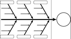
Cause and effect diagrams are also referred to as an Ishikawa diagram for the developer of this diagram, a causal diagram, a fishbone diagram and a herringbone diagram.
Cause and effect diagrams are highly useful in the business world and in the health care environment so that they can identify the causes of product defects and the causes of patient care problems and concerns. The identification of the various causes of problems facilitates the correction of problems and the improvement of processes to prevent future problems and defects.
The center longitudinal line of the fishbone is labeled with the problem or defect. Each of the lines coming off this longitudinal line of the fishbone are labeled for each of the categories of possible causes, and the smaller lines that are part of the fishbone are labeled with all the possible causes of the defect or problem that is being investigated.
Flow Chart
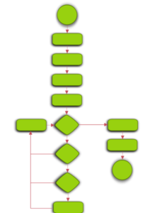
A simple flowchart representing a process for dealing with a non-functioning lamp.
Flow charts display steps of processes. For example, a hospital may want to see the process and work flow for processing a laboratory sample or they may want to visualize the medication ordering and processing processes.
Flow charts are frequently used to identify flawed and problematic processes.
Check Sheets
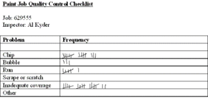
A check sheet is used to collect and visualize data.
The data on a checklist can be used for a number of different purposes including, but not limited to, the construction of a graph with the data that was collected on the checklist and to get an idea about the frequency of an event or issue without the use of complex statistics.
Line Graph
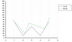 A line graph is perhaps the simplest of all charts and graphs and they share some commonalities with other charts and graphs. For example, line graphs and other charts and graphs have two axes. The vertical axis is referred to as the y axis and the horizontal axis is the x axis, as shown in the picture above. These axes are used in other types of charts and graphs such as a control chart and a histogram, for example, as fully discussed below.
Line graphs also have:
- Intervals along the x and y axes. Graph paper is used to avoid the need to hand draw these intervals, as shown in the graph above.
- Coordinates which are the points where the line for the intervals cross at the x and y axes.
- Points that are the precise location of the coordinate that represents the data. Points are indicated with a dot (.) on the graph, as shown in the graph below.
When coordinates are identified, they are referred to by 2 numbers; one of these numbers is the point where the horizontal line from the point of origin is and the other number the point where the vertical line from the point of origin is.
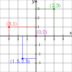
Coordinates
Examples of coordinates are:
- 4,3
- 5,9
- 6, 2
- 0,0
- -3, 8
- 8, -3
- -3, -5
These coordinates are in a specific order. The first number of the coordinate is the point on the horizontal or x axis and the second number of the coordinate is the point on the vertical or y axis.
For example, the coordinate of 6,8 is found at the point where 6 appears on the x axis and 8 is found on the y axis and the coordinate of 8,6 is found at the point where 8 appears on the x axis and 6 is found on the y axis. You should know, that based on these 2 examples, the order of the coordinates are highly important. You must always place the first number of the coordinate on the horizontal or x axis and the second number of the coordinate on the vertical or y axis. If you fail to do this, you will not be in the correct spot. Remember, first place the first number of the coordinate on the horizontal or y axis and the second number of the coordinate on the vertical or x axis.
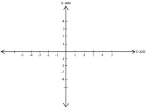
Some line graphs have a point of origin or zero in the center of the graph, negative values to the left of that point of origin along the x axis and below the point of origin along the y axis.
Others, such as the one below, lack a central point of origin. This graph's point of origin as zero is seen in the left lower corner of this graph and labeled as zero (0).
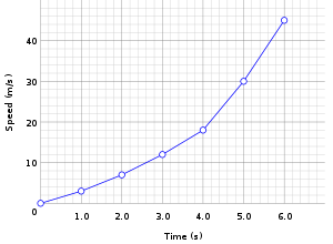
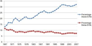
As you can see below, line graphs can include multiple variables so visual comparisons of data can be seen.
Bar Graph
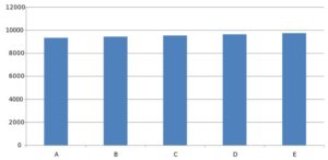
In some respects, a bar graph is similar to a line graph. A bar graph displays data with bars along the x and y axes. The bar graph above has:
- Intervals along the x and y axes
- Coordinates which are the points where the bars cross at the x and y axes.
- Points that are the precise location of the coordinate that represents the data. Points on a bar graph are indicated with the top of each bar
The bar graph above is a comparison of 3 data points which are the east, north and west and some numeric value over time for the 1st, 2nd 3rd and 4th quarters of the year.
Although the bar graph above shows vertical bars, bar graphs can also be done with longitudinal bars.
Pie Graph
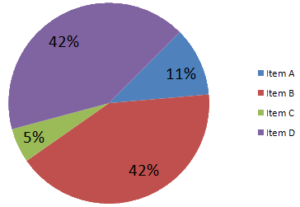
Pie graphs, as the name suggests, are circular graphs to display relatively simple and noncomplex data. Pie graphs, unlike line and bar graphs, do not have intervals, data points, coordinates, an x axis or a y axis.
Pie graphs are typically used to display parts of the whole similar to proper fractions. For example, percentages or real numbers can be used. In the examples above, the CDC and the other pie graphs show percentages. If you add up all the percentages for both graphs, they will add up to 100% which is the whole.
Control Chart
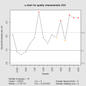
Control charts, which are also referred to as Shewhart charts after the developer of this chart or graph, a process – behavior chart or graph, is based on the statistical data, which is unlike many other charts and graphs that are frequently used.
Control charts can contain a mean, a range, upper and lower limits, a standard deviation, and proportions, for example.
Histograms
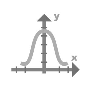
At first glance, a histogram looks like a bar graph, however it is different from a bar graph.
Histograms display frequency data in the context of its distribution. They are constructed using frequency data and placing the frequency data to as closely as possible approximate a bell shaped curve, as shown below.
Pareto Chart
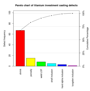
A Pareto chart, named after the developer, is somewhat a combination of a bar graph and a control chart. Pareto charts display data in descending order. As seen in the chart above, the data against the vertical axis is the greatest value and then the other data is displayed in decreasing or descending order.
Scatter Diagram
![]()
A scatter diagram, also referred to as a scatter gram and a scatter plot, shows the correlations of two variables. As previously discussed, a correlation is a negative or positive relationship between two variables. A positive correlation occurs when the relationship between two variables both increase OR both variables decrease. A negative correlation occurs when the relationship between two variables is one of the variables increasing while the other decreases. There are two types of correlation. Correlations can be positive or negative. A positive correlation occurs when both the independent and dependent variables increase or decrease. A negative correlation occurs when one of the variable increases and the other variable decreases.
The scatter diagram above shows a positive correlation because both of the variables along the x and y axes increase together.
Structural Parts of Tables, Charts and Graphs
Tables, charts and graphs, as discussed above, can give us a lot of data that, then, can be interpreted to yield good information. Most tables, charts and graphs show and display two variables; these tables, charts and graphs are referred to as bivariate tables, charts and graphs. Examples of bivariate tables, charts and graphs include a scatter gram and a line graph with two axes and two variables. Similarly, some tables, charts and graphs are trivariate with three variables. A rare few tables, charts and graphs, however, show and display only one variable; these tables, charts and graphs are referred to as univariate tables, charts and graphs.
Some of the structural parts of the graph include its:
- Legend
- Labels
- Intervals
- Axes
- Point of origin
Legend
The legend of a table, chart or graph gives you a brief summary of what the table, chart or graph is depicting. It is typically placed near the graph in the right or left upper corner or the right or left lower corner of the graph display, and OUTSIDE of the data points so that these data are not obliterated.
Some legends are relatively simple and straightforward, such as the one below that gives you information about the bars and their colors and the meanings of each in terms of the location within a building such as the north wing, the east wing and the west wing.
Labels
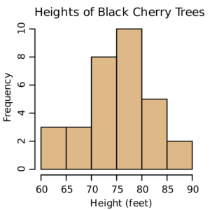
Labels are an essential part of a graph. Without labels, you will have no idea what the data is showing and what it is representing. Labels include the name of the graph, and the names of the x and y axes.
As shown in the graph below, the title of the graph is the "Heights of Black Cherry Trees"; the x axis is labeled as "Height in Feet" and the y axis is labeled as " Frequency".
Intervals
All tables, charts and graphs need intervals that are clearly labeled. These labeled intervals allow us to determine a precise or approximate value for each data point. Without intervals and interval labels, we would have no idea, for example, how many black cherry trees were a specific height and no idea of what heights these black cherry trees are.
In the chart above, the intervals for the heights of the black cherry trees range from 60 to 90 feet and each interval is an interval of a consistent five feet because, from left to right along the horizontal x axis the heights in ascending order are 60, 65, 70, 75, 80, 85 and 90.
Another example of intervals and interval labeling is shown below. The intervals are not labeled as clearly in the graph below as they were in the graph above. You, therefore, have to determine the vertical and horizontal intervals as based on the information that you have so that you can get more precise values for each of the data points.
For example, the intervals on the y axis are in increments of 1,000 but the individual interval horizontal lines are not labeled. You can determine and label these points by:
- Counting the unlabeled lines between the labeled lines of 1000 to find 9 lines
- Determining that each unlabeled lines between the labeled lines of 1000 is an increment of 100 because there are 9 unlabeled lines between the labeled lines of 1000
You can then label each of the unlabeled interval horizontal lines as, for example:
- 1,100, 1,200, 1,300, 1,400, 1,500, 1,600, 1,700, 1,800, and 1,900 and as
- 100, 200, 300, 400, 500, 600, 700, 800, 900
Axes
The vast majority of tables, charts and graphs have axes. An exception, for example, is a circular pie graph that lacks an axis.
The standard of graphing indicates that the horizontal line is the x axis and the vertical line of the graph is the y axis.
Point of Origin
The point of origin on a table, chart and graph is sometimes shown as a zero and sometimes it is left unlabeled but understood as a zero.
Some graphs, such as the one above, have a point of origin or zero in the center of the graph, with negative values to the left of that point of origin along the x axis and below the point of origin along the y axis and positive values to the right of that point of origin along the x axis and above the point of origin along the y axis. Others, such as the one below with only positive values, have a point of origin as zero is seen in the left lower corner of this graph and labeled as zero (0).
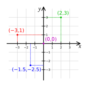
Cartesian Coordinates
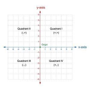
As stated above, some graphs have all positive numbers; the one below has both positive and negative numbers. Graphs with both positive and negative numbers have four quadrants, as shown in the graph below.
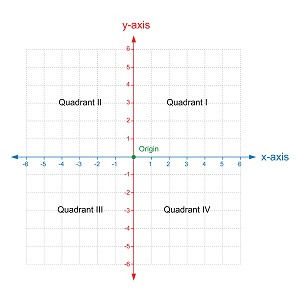
The four quadrants in the graph above are labeled as I, II, III and IV.
- Quadrant I has positive numbers along the horizontal x axis and positive numbers along the vertical y axis.
- Quadrant II has negative numbers along the horizontal x axis and positive numbers along the vertical y axis.
- Quadrant III has negative numbers along the horizontal x axis and negative numbers along the vertical y axis.
- Quadrant IV has positive numbers along the horizontal x axis and negative numbers along the vertical y axis.
Standardized terminology for the identification of coordinates, which are the points where a data point on the x axis and the data point on the y axis are identical. These coordinates are identified and labeled with 2 numbers separated by a comma. One of these numbers is the point where the horizontal line, or x axis, is from the point of origin is and the other number the point where the vertical line from the point of origin is. It is shown as x, y.
The point of origin is 0,0
This Cartesian coordinate system is used to interpret data on a graph and also to construct a graph by plotting points on the graph.
Examples of coordinates are:
- 4,3 where 4 is on the x axis and 3 is on the y axis
- 5,9 where 5 is on the x axis and 9 is on the y axis
- 6, 2 where 6 is on the x axis and 2 is on the y axis
- 0,0 where 0 is on the x axis and 0 is on the y axis and this is the point of origin on a four quadrant graph
- -3, 8 where – 3 is on the x axis and 8 is on the y axis
- 8, -3 where 8 is on the x axis and -3 is on the y axis
- -3, -5 where -3 is on the x axis and -5 is on the y axis
By looking at the coordinates, as listed above, you can not only plot these coordinates on a graph but you can also determine which quadrant of four quadrants the coordinates are in.
For example, the following coordinates are found in these quadrants.
- 4,3 is the point where 4 is on the x axis and 3 is on the y axis and this is found in quadrant I because quadrant I has positive numbers along the horizontal x axis and positive numbers along the vertical y axis. Quadrant I is the only quadrant which has two positive numbers, on along the x axis and the other along the y axis.
- 5,9 is where 5 is on the x axis and 9 is on the y axis and this is also found in quadrant I because quadrant I has positive numbers along the horizontal x axis and positive numbers along the vertical y axis; quadrant I is the only quadrant which has two positive numbers, on along the x axis and the other along the y axis.
- 6, 2 is where 6 is on the x axis and 2 is on the y axis. Again, these coordinates are both positive numbers and, therefore, found in quadrant I.
- -3, 8 is where – 3 is on the x axis and 8 is on the y axis and this is found in quadrant II because quadrant II has negative numbers along the horizontal x axis and positive numbers along the vertical y axis. Quadrant II is the only quadrant which has negative numbers along the horizontal x axis and positive numbers along the vertical y axis.
- In contrast to the coordinates immediately above, 8, -3 is where – 3 is on the x axis and 8 is on the y axis and this point is found in quadrant III. Quadrant III is the only one of the four quadrants that has positive numbers along the horizontal x axis and negative numbers along the vertical y axis.
- -3, -5 is where -3 is on the x axis and -5 is on the y axis and this point is found in quadrant III. Quadrant III is the only one of the four quadrants that has negative numbers along the horizontal x axis and negative numbers along the vertical y axis.
RELATED TEAS MEASUREMENT & DATA CONTENT:
- Interpreting Relevant Information From Tables, Charts and Graphs (Currently here)
- Evaluating Information in Tables, Charts and Graphs Using Statistics
- Explaining the Relationship Between Two Variables
- Calculating Geometric Quantities
- Converting Within and Between Standard and Metric Systems
